Building an Enterprise Design System from Scratch: A Complete Guide for Scalable Enterprise Applications (2026)
Building an Enterprise Design System from Scratch
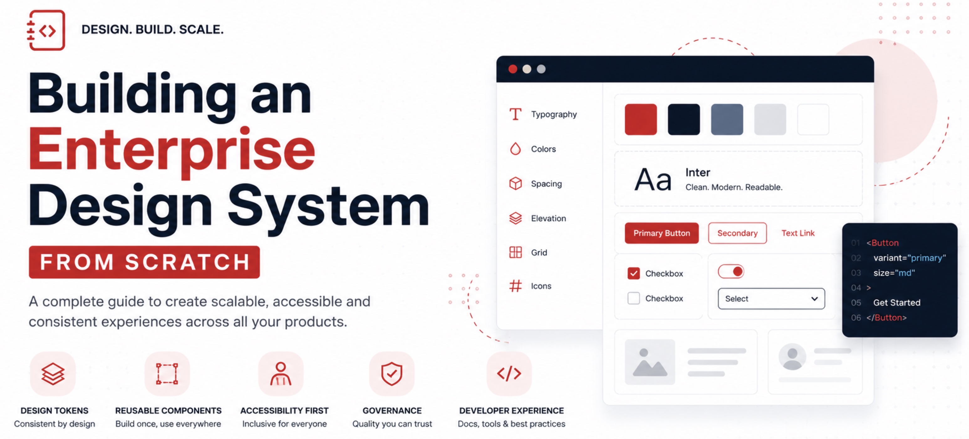
Modern organizations rarely build just one application. They build dozens or even hundreds of web applications, customer portals, admin dashboards, mobile apps, and internal tools. Without a unified approach, every team creates its own UI components, resulting in inconsistent user experiences, slower development, higher maintenance costs, and accessibility issues.
An enterprise design system solves these challenges by providing a shared language between designers and developers. It standardizes visual styles, reusable UI components, accessibility guidelines, and engineering best practices so teams can build faster while maintaining consistency across products.
This guide explains how to build an enterprise-grade design system from the ground up, covering architecture, governance, implementation strategies, accessibility, performance optimization, and long-term maintenance.
Quick Start Blueprint (If You Need to Start This Quarter)
If your organization needs visible progress quickly, avoid attempting to build everything at once. Focus on a narrow, high-impact scope and deliver a production-ready foundation in the first 90 days.
| Phase | Timeline | Outcome |
|---|---|---|
| Foundation | Weeks 1 to 3 | Principles, token architecture, typography scale, color system, contribution workflow |
| Core Components | Weeks 4 to 8 | Buttons, inputs, form controls, cards, feedback states, and accessibility baselines |
| Adoption Pilot | Weeks 9 to 12 | One real product migration, usage telemetry, documentation hardening, and release governance |
What Is an Enterprise Design System?
An enterprise design system is a centralized collection of reusable design standards, UI components, coding guidelines, documentation, and governance processes that multiple products and teams use consistently.
Unlike a simple component library, a mature design system includes:
- Design principles
- Design tokens
- Typography standards
- Color system
- Spacing system
- Grid layouts
- Icons
- Component library
- Accessibility standards
- Documentation
- Versioning
- Governance model
- Contribution workflow
The goal is not simply creating reusable buttons. It is creating a scalable product ecosystem.
Why Every Enterprise Needs a Design System
Organizations often encounter the same challenges:
- Different applications use different button styles.
- Teams duplicate the same components repeatedly.
- Developers spend unnecessary time rebuilding common UI elements.
- Accessibility compliance becomes inconsistent.
- Design changes require updates across many applications.
- Product branding varies from one application to another.
A design system addresses these issues by creating reusable building blocks that improve both user experience and developer productivity.
Benefits include:
- Faster product development
- Consistent user experience
- Reduced maintenance
- Better accessibility compliance
- Simplified onboarding for new developers
- Easier scaling across teams
- Lower development costs
Step 1: Define Design Principles
Every successful design system begins with clear principles rather than components.
Example principles:
- Simplicity over complexity
- Accessibility by default
- Performance first
- Mobile-first experience
- Consistency over customization
- Reusability before duplication
These principles guide every design and engineering decision.
Step 2: Build Your Design Tokens
Design tokens are the foundation of a scalable design system. Instead of hardcoding colors or spacing values throughout applications, define reusable variables.
Common design tokens include:
Colors
- Primary
- Secondary
- Success
- Warning
- Error
- Background
- Surface
- Border
Typography
- Font family
- Font size
- Font weight
- Line height
- Letter spacing
Spacing
- 4px
- 8px
- 12px
- 16px
- 24px
- 32px
- 48px
Border Radius
- Small
- Medium
- Large
Shadows
- Elevation 1
- Elevation 2
- Elevation 3
Design tokens enable centralized updates across all applications.
Step 3: Establish Typography Standards
Typography plays a critical role in usability.
A recommended hierarchy includes:
- Heading 1
- Heading 2
- Heading 3
- Heading 4
- Subtitle
- Body Large
- Body Regular
- Small Text
- Caption
Maintain consistent spacing, line height, and responsive behavior for every text style.
Step 4: Create a Color System
A strong color system goes beyond choosing attractive colors.
It should define:
- Primary palette
- Secondary palette
- Neutral palette
- Status colors
- Interactive states
- Dark mode variants
- High contrast variants
Ensure every color combination meets accessibility contrast requirements.
Step 5: Create the Foundation Components
Avoid building every possible component immediately.
Start with the most commonly used components:
- Button
- Input
- Text Area
- Checkbox
- Radio Button
- Toggle
- Select
- Card
- Badge
- Avatar
- Modal
- Dialog
- Toast
- Tabs
- Accordion
- Table
- Pagination
- Tooltip
- Spinner
- Progress Bar
Each component should include:
- Documentation
- API reference
- Accessibility notes
- Code examples
- Usage guidelines
Step 6: Accessibility from Day One
Accessibility should never be an afterthought.
Key practices include:
- Semantic HTML
- Keyboard navigation
- Screen reader support
- Focus management
- Color contrast compliance
- ARIA labels
- Error messaging
- Skip navigation links
Aim to align with WCAG 2.2 Level AA requirements.
Step 7: Create Comprehensive Documentation
Documentation is often the difference between adoption and abandonment.
Include:
- Installation guide
- Getting started
- Component usage
- Best practices
- Accessibility recommendations
- Code examples
- Migration guides
- FAQs
- Contribution guidelines
Interactive examples greatly improve developer experience.
Step 8: Build a Governance Model
Without governance, design systems quickly become inconsistent.
Define:
- Design review process
- Component approval workflow
- Version management
- Deprecation policy
- Contribution guidelines
- Release schedule
This helps maintain quality while enabling growth.
Step 9: Choose the Right Technology Stack
A modern enterprise design system typically includes:
Design
- Figma
- Design Tokens
Development
- React
- TypeScript
- Web Components (optional)
Documentation
- Storybook
Testing
- Jest
- Playwright
- Visual regression testing
Package Management
- npm
- pnpm
CI/CD
- GitHub Actions
- Azure DevOps
- GitLab CI
Select technologies that fit your organization ecosystem and long-term maintenance goals.
Step 10: Versioning and Releases
Treat your design system like a product.
Adopt semantic versioning:
- Major releases for breaking changes
- Minor releases for new features
- Patch releases for bug fixes
Maintain clear release notes and migration guidance for consumers.
90-Day Rollout Plan for Enterprise Teams
Successful design systems are adopted through product delivery, not just documentation. Pair every release with migration support and clear success metrics.
Month 1: Align and Define
- Identify executive sponsor and cross-functional system owners.
- Choose one pilot product with active roadmap pressure.
- Publish token naming conventions and design review checklists.
Month 2: Build and Validate
- Ship core primitives with unit tests, visual tests, and accessibility checks.
- Run component office hours with product teams and collect friction points.
- Measure bundle impact and identify dead code opportunities early.
Month 3: Adopt and Scale
- Release migration playbooks for at least 3 high-usage UI patterns.
- Define deprecation policy with target timelines and compatibility windows.
- Publish quarterly roadmap based on telemetry and product team requests.
Common Mistakes to Avoid
Many design systems struggle because they:
- Build too many components too early
- Ignore accessibility
- Lack documentation
- Have unclear ownership
- Skip developer feedback
- Focus only on design
- Neglect testing
- Allow uncontrolled customization
Start small, gather feedback, and iterate based on real product needs.
Measuring Success
Track metrics to understand adoption and impact:
- Number of applications using the design system
- Component reuse rate
- Development time savings
- Accessibility compliance
- Bundle size improvements
- Developer satisfaction
- Defect reduction
- Documentation usage
These metrics help demonstrate business value and guide future improvements.
Implementation Checklist
Use this checklist before announcing your first stable release:
- Token system is versioned and consumed by both design and code.
- Component APIs follow naming and behavior standards.
- Keyboard and screen-reader behavior is validated for all core components.
- Design-to-code examples are documented for common product patterns.
- Deprecation warnings are visible in development builds.
- Release notes include migration examples and breaking change guidance.
- Adoption dashboards are tracking usage and component health.
Future Trends
Enterprise design systems continue to evolve with:
- AI-assisted component generation
- Automated accessibility checks
- Cross-platform design tokens
- Multi-brand theming
- Design-to-code automation
- Intelligent documentation
- Real-time usage analytics
Organizations that invest in scalable design systems are better positioned to deliver consistent digital experiences while reducing engineering effort.
Conclusion
Building an enterprise design system is not simply a UI project. It is an organizational investment that improves collaboration, consistency, and long-term scalability. By establishing strong foundations with design tokens, reusable components, accessibility, documentation, governance, and measurable outcomes, organizations can accelerate product development while maintaining a unified user experience.
A successful design system evolves continuously. Start with core principles, build reusable foundations, listen to feedback from designers and developers, and refine the system over time. With thoughtful planning and disciplined governance, your design system can become one of the most valuable assets in your organization digital ecosystem.
Frequently Asked Questions (FAQ)
What is the difference between a UI library and a design system?
A UI library provides reusable components, while a design system includes design standards, governance, documentation, accessibility guidance, and development workflows.
How long does it take to build an enterprise design system?
An initial version can often be developed in a few months, but a mature design system is an ongoing product that evolves alongside organization applications.
What technologies are commonly used?
Many organizations use Figma for design, React and TypeScript for development, Storybook for documentation, and automated testing tools such as Jest and Playwright.
Why are design tokens important?
Design tokens centralize design decisions such as colors, spacing, typography, and shadows, making it easier to maintain consistency and update multiple applications efficiently.
Can a design system support multiple brands?
Yes. By using themes and configurable design tokens, a single design system can support multiple brands while sharing the same underlying components and engineering standards.